Tuesday, February 28, 2006

Last week I sent the Colorado HRS a check for $134.75 from the Lulu sales of the booklets Stranded Color Knitting and Wild About Color Knitting Patterns. That amount was for the sales from December. The next time they send me a check (in May) it will be for much more. I will have the ruffled colorwork sock pattern available for purchase or download by tomorrow. I knit the sock up in another color combo because I like to show different options. It was also helpful because I found a mistake in the chart.

Speaking of pattern mistakes, there is a second mistake in the Maarja's sock from Folk Knitting in Estonia. The first row of the heel it says K2 green when it is supposed to be K2TOG green. I decided to rip out the sock because it just wasn't working for me, no matter what modifications I tried. Ugly, ugly, ugly.

What do stencil artists have to say?

A recent work by Banksy, around L.A.

Goldmine Shithouse - The Clown Flippers

Before I post something more extensive about the "recent" grungy, stencilated and mashed-up aesthetics in fine arts, let me introduce you to the Goldmine Shithouse collective. They started off as a fairly loose group of artist friends, who would meet once a week to stir things up, which they then proceed to do. One of them would start a painting, and then pass it on to others. Each work was a chain creation. Out of this group, three people remained: David Hochbaum, Travis Lindquist and Colin Burns. They liked the way it worked for them so much, they started exhibiting their works. It worked. And it is still working three years later.

Friday, February 24, 2006

I'm usually so far behind whatever is going on in the world of knitters it is pathetic. I do, however, have photos of my front door and the view outside it from back in July.

Here's my lovely view. It is hard to see but there is a huge steep arroyo/ditch between us and the other house. The coyotes like to hang out in there.


Here's the front door itself. DH likes to make Adirondack chairs as you can see.


I am going to offer the ruffled floral sock pattern for sale next week to benefit rabbit rescue. I need to knit up another prototype this weekend just to make sure the pattern works first. And I should finish the Nancy Bush socks - currently I think they're ugly but perhaps the fancy toe will redeem them.
I've been meaning to post a photo of my usual knitting spot complete with Ott lite. I keep my current knitting project in a basket nearby.


I really like the view from my knitting spot. I see squirrels and cottontail rabbits and occasionally red-tail hawks and coyotes. Once I looked up and was surprised to see three horses in our yard. Fortunately their owners were quick to lead them back home.

Thursday, February 23, 2006

I'm not sure


what this is, but I like it.
link

The Finger

The above emoticon, by Dan Wade, is dedicated to the Montreal fashion students fighting for their right of expression.
And the following picture (The Red Ball No.1 (2000)), by Loretta Lux, is a counterbalance.
Oh, how I love the static taste of play!

(via)
A scary list.


I'm not liking the textured part of Maarja's socks with my thicker gauge so I'm only going to do it on the top. I do plan to do the cute toes she uses though.

Wednesday, February 22, 2006

Alert the media! I've found an error in a Nancy Bush pattern. I've knit a zillion of her patterns and this is only the second time I've found an error.

I'm making Maarja's Socks from Folk Knitting in Estonia and the chart diagram says purl when they really mean YO. To make these in an adult's size, I'm using size 2 dpns and Knitpicks Merino Style yarn. I'll get a scan of the sock in progress tomorrow.

Bosco is greatly enjoying the special treatment and lots of yucky canned cat food. The other two pets are a bit jealous and are ignoring me as you can see in this photo.


Tuesday, February 21, 2006

Is a Fake Pollock Better?


May not a Pollock forgery that passes for authentic be the best Pollock of all?
- asks Don Foster in a recent article in N.Y.Times.
Here is a more of the article, which will soon be unavailable for free reading:

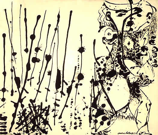
LAST year, 24 paintings were unveiled as previously unknown works by Jackson Pollock. (...)

But Richard Taylor, a physics professor retained by the Pollock-Krasner Foundation to subject six of the paintings to computer-assisted analysis, discovered that the paintings may well be fakes — at least, the drips lack Pollock's characteristic geometric pattern. The collection's owner disputes that this finding is conclusive.

At the heart of the controversy lie critical questions about artistic meaning and value that have vexed literary scholars no less than art historians. Would the exposure of a hitherto successful forgery diminish Jackson Pollock's reputation as a unique creative genius, by demonstrating that his work is replicable? If Shakespeare were credited with a mediocre poem hitherto presumed to be written by a lesser light, would that change our opinion of Shakespeare?

"What matter who's speaking?" asked Michel Foucault, quoting Samuel Beckett.

What matter whose painting? The implied answer — no matter at all — takes for granted that cultural artifacts are symptomatic of the society that produced them. The critic's job, then, is to assess the product on its own merits, quite apart from the artist's name or reputation. If "Hamlet" had been written by Christopher Marlowe or Edward de Vere, not by William Shakespeare, would the text therefore be less great? Perhaps not, but we would think of it in a different way.

If a previously authenticated Pollock painting was actually done by a disciple, or by Norman Rockwell, or by a monkey with a paintball gun, yet looks to be authentic Pollock, so what? The look-alike might be worth less at Sotheby's, but would it be worth less as art?

At stake in such attributional debates is a question of methodology: how can experts tell the difference between the real thing and an imitation? If the qualitative judgment of Pollock or Shakespeare scholars differs from quantitative analysis of a computer-assisted study, whose verdict will carry the day? That Richard Taylor's analysis can inform us of patterns generated by Pollock much of the time provides no guarantee that Pollock reproduced those patterns all of the time. But if the Pollock canon includes a forgery, it may be that Taylor's analysis provides a more objective mode of analysis than aesthetic appreciation.

(...)
In the art world, the problem of attribution is complicated by market value.(...) if you have paid, say, a half-million for a Pollock painting and some physicist and his computer say that you were hoodwinked, the question of the work's value is not wholly aesthetic.

Literary and art attribution is not just a game of pin the name on the donkey. A community of interested scholars must consider all available evidence, and come to a consensus. In the case of the Pollock canon, the jury is still out. It would be a mistake, in my opinion, to sell the disputed Pollock canvases at a discount without more evidence than computer-assisted analysis of drip patterns.

Meanwhile, Jackson Pollock may be chuckling in his grave: if the object of Abstract Expressionist work is to embody the rebellious, the anarchic, the highly idiosyncratic — if we embrace Pollock's work for its anti-figurative aesthetic — may faux-Pollock not be quintessential Pollock? May not a Pollock forgery that passes for authentic be the best Pollock of all?


Well, may it not? This question joins the recent Duchamp controversy and many, many other cases where an artist's desire for artistic freedom seems to be forgotten when his works are judged by computer programs or valued for their size, or put on a pedestal and turned untouchable.
There is one factor, however, that tends to be forgotten in all our excitement about the real meaning of art and its heroes. I mean psychology of art. Namely, two points about it:
1) As art viewers, we feel the need for coherence. The work has an artist, the artist has an identity, the identity is not just some drips of paint scattered across the canvas of the soul, but it is a whole, it makes sense. In this case, it means a) Pollock was a painter; b) Pollock was a good painter; c) Pollock's paintings are related to a) and b); finally, d) we can expect that Pollock's work can only be his (there are recognizeable patterns, then).
This final point is the most questionable, and obviously we often fail at it, misjudging a work, attributing it to the wrong painter, etc. But our failures are only more proof of the possibility of success. And if we wish to name some of the 20th-century works of art that are based on "anonimity", such as Yves Klein's exhibition of air, we must notice that they were conceptual works of art, and we are ready to pay either for the event (as a performance of burning money), or for the signs of the concept (as the partiture of Cage's 4'33). The silence, the air, we somehow don't actually assign to the artist. Earth, after all, is not Manzoni's.
2) Reality check: artists aren't always right. Not even about their own work. Pollock might have dreamed of " the rebellious, the anarchic, the highly idiosyncratic", but he never moved beyond the canvas (he never even made the tiniest hole in it, as Fontana ever-so-modestly mentioned). Artists say a lot of things. And dream of even more. That's our job. If we don't dream, something is wrong. As Jules Verne put it, there are no great achievements without exaggerated expectations. But if this is true, we simply cannot take the artist's word for it. Or at least, we don't need to. Not even when they're dead and famous (what a scary combination!). That's why we might just pay more attention to our way of seeing The Fountain, or a drip painting, than to that of the artist. After all, if we listened to the wonderful, charming futurists, we wouldn't even know them.
I suppose if we join the dots 1) and 2), we see that the artists need a story and we need one. Trying to make us forget any story and see the "pure drip value" of a Pollock seems absurd. On the other hand, promoting the avant-garde tendency towards anarchy as a way of promoting the very artists that lived this tendency is, well, silly. Damn it. We actually need the library, and we need the museum. And some of us, yes, would like to know if the drip-dropped canvas they own was made by a genius or not. Does it change the value of the canvas? Of course. Why? Because we need the story.

Monday, February 20, 2006

Here are the Dad's Easy Cable Socks from Socks, Socks, Socks. They're knit with Peruvian Highland wool and I had to go up to a size 6 (US) needle to get them to fit.

Young Fashion: The Thimble Scandal


Here is something spicy from an area I haven't been paying much attention to - fashion.
I have received the above picture from Maryla Sobek, a friend who teaches at the Fashion School of the UQAM university (huge French-speaking university in Montreal, Canada). The picture, by Anne Marie Sauriol (a student at the university), was going to be a poster for the graduation fashion show (roughly translated, the sign on the side states "Honoring Fashion").
And all hell broke loose.
The director considered it a scandal. Something horribly vulgar and absolutely unacceptable. My friend suggests that the younger generation has a different sensibility, and might see this as a provocation, but not necessarily as a vulgar offense.

There is a large group of people that still find the phrase "fuck you" extremely offensive. Sarah Lucas is not one of them. The amateurs of Sarah Kane's dramaturgy are not among them either. People who experiment don't get offended. They might get bored. Or disappointed. And to me that is more of a risk here.
Bored, because we've seen the middle finger so many times it really isn't anything special.
Disappointed, because we might be expecting something we won't necessarily see on the show.
Now here is my counterargument on both points:
1) This doesn't bore me. Because it has a twist. The thimble - the cap, the condom, the hat, the head, the dot over the 'i', the filter, the creator. The sublimation. The humorist. The hidden treasure. It says "now that I got your attention, come here".
2) Something else this picture says is "We're fed up. And that's our beginning." Which raises expectations. One feels like saying "If you're so tough on everyone else, you better be good". And that's a pretty dangerous zone. Easy to lose.
3) Or is it? I'm not sure the poster is really a statement. It could be seen more as an artsy PR work, Benetton-style. As we know, in its most controversial (and talked about) posters, Benetton chooses topics not necessarily related to the issues it is directly involved with. Rather, it says "we see what you see. we feel what you feel." It speaks to its target group by using empathy. We could say a similar thing is happening here: the students themselves would not be offended by this sort of a poster; it is too common. Just think of all the t-shirts with "bad bitch" written on them. Anyone studying fashion must be aware of what is happening in social behavior, and I suppose it is a good idea to use it, answer it, and then, if you really really want to be an artiste, defy it. So, if this is a statement, I would say it isn't a positive one in the sense that it doesn't actually affirm anything, but rather appeals to a negative attitude that is already present in the public. And then, it uses it, associating itself with the street punk attitude.
Then again, students still have more experience as consumers than creators. So their creation can also be seen as a reaction of a fashion consumer. To what? Well, take Benetton, the edgiest fashion label publicity-wise. The 18-to-20-something year olds of today (including myself) weren't only brought up on Benetton's "ideals". We see the hypocrisy: Benetton had no problem going from this:

(1984)

to this:
(1998)

and finally to this:
(2006)

What are we left with? How can a designer still have ideals, if those ideals are used by marketing specialists in a totally arbitrary way, as it suits the moment? Maybe someone got tired of selling pink dreams and black, satin fairy tales with android proportions? So what is there left to say, what is there left to fight for or invent? I hope, a lot. But just as we needed Artuad's senseless screams to get to a new form of theater, as we needed Cage's silence to get to new music, so in order to get to some fresh, original ideas from time to time we might need a middle finger stuck up high. Hopefully, with a thimble on top.

Light up the night


Have you heard of the LED throwies? It looks like very good "art material", doesn't it?
via

Saturday, February 18, 2006

Here are some more photos to show the difference between Fair Isle knitting and other types of stranded color knitting. I'm trying not to get too complicated but purists only consider a garment to be Fair Isle if Shetland yarn is used and the pattern has no long floats (spots where you carry an unused yarn for a long time). Fair Isle charts are usually very symmetrical as well.

It does get confusing because there are similarities between Fair Isle colorwork and other types, especially other types of European stranded color knitting which evolved at the same time. I've even seen traditional Fair Isle patterns that did not use the color changes between the foreground and/or background patterns. Fair Isle does use the X and O patterns pretty exclusively and they often intersperse these with smaller patterns called peeries. I've never seen a Fair Isle garment that only used two colors.

Fair Isle Chart (Look at the large X at how the background colors change symmetrically)


Not a Fair Isle Chart (Estonian) even though multiple colors are used


Fair Isle Tams with lots of beautiful subtle color gradations


Not Fair Isle tams - although multi-colored each chart pattern section has only 2 colors


Stranded Color Knitting has as an in-depth annotated bibliography but I'll briefly recommend 4 books.

Sheila McGregor's Traditional Fair Isle Knitting (very inexpensive Dover reprint)
Carol Rasmussen Noble's Knitting Fair Isle Mittens and Gloves (easy to find although some chart errors in the patterns)
Ann Feitelson's The Art of Fair Isle Knitting (probably out-of-print by now??)
Alice Starmore's Book of Fair Isle Knitting (excellent book on the subject but you'll most likely have to sell one of your children to get a copy)

Friday, February 17, 2006

Margene asked me to do a blog entry discussing the difference between Fair Isle knitting and other types of stranded color knitting. I've talked about this here several times before and I discussed it in the Stranded Color Knitting booklet.

I'll use the analogy of bread baking. The French are master bread bakers and take their bread very seriously. Some American sourdoughs and supermarket breads call their products "French" bread. They use the term because the bread is crusty or shaped similarly to traditional French breads. But calling all stranded color knitting Fair Isle knitting is more like calling a Jewish challah or Indian naan a "French" bread.

Fair Isle is the southernmost island in the Shetland Islands and is between Norway and Scotland. In the distinctive style of Fair Isle knitting the foreground and/or background colors often change in a single pattern chart. This usually doesn't happen in other types of stranded color knitting. (An exception is the cover purse on Andean Folk Knits, where the foreground color changes from red to orange to green.)

Fair Isle:


Not Fair Isle (Latvian):


Fair Isle:


Not Fair Isle (Norwegian):


Fair Isle:


Not Fair Isle (Peruvian):


The heart theme sock is stalled because I can't decide on what colors I want to add. I am also working on one of the Great American Aran Afghan squares done in the round but I have to rip out a few rows and figure out a mistake I made.

So what do you do when all your knitting is stalled? Start something new!


Here is the beginning of the Dad's Easy Cable Sock pattern from Socks, Socks, Socks. I am using size 4 dpns and Peruvian Highland wool but I'm not completely positive they will be wide enough for my narrow feet. This pattern has no purl stitches so it is much less stretchy than most cable patterns.

Wednesday, February 15, 2006

I'm starting a sock with a heart theme (a little late I know). I need to add more colors and I may do a lace foot. We'll see...


Peaches wishes everyone a belated Happy Valentine's Day! DH brought me flowers and she felt it necessary to attempt to eat some of them. Bosco is still hanging in there and enjoying lots of TLC although we still have no diagnosis.

I'm just about finished with the second sock. It seems like it took me forever to finish them but I'm looking forward to my next project. I don't actually know what my next project will be but I'm looking forward to it anyway.

Monday, February 13, 2006

I recently googled the word "color" and found some interesting web sites.

Color Psychology This web site goes beyond the usual stuff and tells you that opera singers have meltdowns more often in yellow rooms and that weight lifters can lift more in blue rooms.

Causes of Color If you have a child who asks a lot of questions like "Why is the sky blue?," you need this scientific web site.

Online Color Scheme Generator Pick a color from the large grid and you'll automatically get a selection of many colors that work well with it.

Test for Color Blindness

Color Lab Select a few colors and see how they look together.

Color Matters This is a comprehensive web site on everything color-related including a bulletin board.

Sunday, February 12, 2006

Make performance art. Be positive.

"At this very moment, Rob Bohn is holding a red jacket in his hand and standing on the corner of 23rd and Broadway near the Flatiron Building.He is excruciatingly cold for he cannot wear his jacket unless he is given an orange.
Simply find a way to get an orange to him and he will thankfully put on his red jacket.
He will be standing on the corner until the sun sets - wearing or not wearing his red jacket.

He is depending on you."


This performance, tagged as "wappening", was created by Lee Walton.
It worked:

Friday, February 10, 2006

Here's what my shortened version of Liivi's sock from Folk Knitting in Estonia looks like. I'm doing the colorwork on the second sock and am leaving the plain part for this weekend when I can't concentrate.


Not being able to concentrate seems to be a theme for me lately. I keep telling DH I'm losing brain cells on a daily basis. I'm dying to come up with a Valentine's sock with red and hot pink and purple in lace and colorwork but I'm not sure if I can manage it this weekend with a sick cat and a husband who is home for 3 days. I still hope to get to work on the Starmore pillow but I have to change the number of pattern stitches first to accomodate for my gauge.

Cindy Wright: the flesh of paint


Cindy Wright, Skin 2, Oil on canvas (2004)

What I like about these works is that beyond their apparent photo-realism hides a playfulness only possible through painting. It is as if we discovered that beyond the surface of things lie some other levels of things which make them differ. Thus, real skin is different from a photo, a photo is different from a painting. And, mind you, the skin above is different from yours: it hides different shadows.
Different shadows.
Oh, and one more thing: doesn't this man seem a little crazy? (Maybe not crazy? Maybe wild enough?)

It's Jan Fabre. Nice touch.

Thursday, February 9, 2006

Angela de la Cruz at the Culturgest: of guts and canvas


I Suppose Angela de la Cruz's art is usually described as the questioning of painting and stretching the limits of canvas. This seems to me not only obvious, but also not-that-fascinating. On the other hand, if we go beyond this label, we might just find a sculptoric experience truly worthy of participation.
Participation, here, implies that the cold world of de la Cruz's objects has a life of its own; it is a process we can investigate and play with, using the wrecks just as the artist does - to transform our perception of... identity? purity? creation?
The idea of recycling being as old as modern art, it is still a challenge. After Duchamp's and Schwitters' collages, after Fontana's holes and Rauschenberg's manipulations, playing with the very material of a painting - i.e., treating it as a sculpture, might seem absurd.
Apparently, though, there is still a lot to be said. Maybe not "rethinking painting", but using it as any other sculpting material, considering the canvas, the frame, the paint, to be primary matter. The magic word here is convention. If we have a convention, we can express things. We can find ourselves in it and, if we feel the need (?), break it, or at least work our way beyond it. And painting, in its technical perspective, is a beautiful convention. It seems to be there just waiting to be distorted, abused or shred to pieces. So what happens when we consider the canvas a partner of a conversation, a performative matter, one that can act out just as a performer would? We get a world full of characters, semi-characters, objects as real as people.

Angela de la Cruz's most recent exhibition at the Culturgest in Lisbon is a voyage through despair. We begin with evidence of violence. Just as there are no perfect people, no painting here actually has a format. The very presence of dimensions next to the work seems ridiculous - they are living proof of the abandonment of dimensions, of the decay of form. Clearly, decay is far from absence. Decay is the period when something happens, the appearance of a form that comes from itself, not from the essential objects. Or maybe, decay, here, is the discovery of an essence previously unrecognized? The paintings hurt, they grow, they break and they hide. There are two, three works per room, and they sometimes resemble cartoon characters, trying to squeeze into a corner or hide on the ground.
But they can't. They are too easily identifiable, colorful, awefuly, frighteningly three-dimensional. In all their havoc, they cannot escape being themselves. Are they the remnants of something gone? That is the first impression, as their designs still recall some original shape. Look carefully, though. The origin is a myth. The danger, says Wittgenstein, is to try to go before the beginning. The beginning is here, in this state of somethingness, in these monstrous, lonely bodies.

As we move on, we discover a difference: someone has been trying to put things back to order. There are stitches, there is glue, there are screws putting it all back together. But try Heraclitus - you can never step in the same river twice. Try all the contemporary Homers - you never go back home. They look miserable, suffering, and strangely familiar, those paintings and objects (delightful chair on a stool, somewhat too surrealist-like yet attractive double piano) that try to remember what they were, or what they should have been.
We move yet further, to a new level. Here, reality is what it is. Things are affirmed. Old sculptures are recycled in new ones, without trying to find their soul. They live new lives, with all their imperfections, they are clustered and folded, they support others, they are the stuff that things are made of. This clean box has some old canvas sticking out behind it. That white sheet of canvas on the ground hides some old guts, some old stories. And it won't get any better than that. Not here, not in any other real world. So we might just as well find it damn attractive.
ps.: If possible, I'll try and take some pictures of the exhibition itself, as the ones above are sacked from the net.

Wednesday, February 8, 2006


Here's the Lace Arrow Sachet (scroll down to link to pattern) done in fingering weight pink wool yarn with a 4 stitch I-cord tie. I'm going to have to find some loosely woven fabric to wrap the lavender in before I fill it but it should do the trick. I may come up with a smaller sachet pattern of my own if I have time this week.

Tuesday, February 7, 2006

Last month I was working on an herb article and I had to buy lavender flowers. I bought a huge amount so I thought I'd knit up a few sachets to stuff with lavender and stick in the dresser drawers and in the yarn stash. Trader Joe's even sells nifty little dryer bags full of lavender. I'm either going to make up a pattern or use THIS one. Probably both since I have so much lavender.

Thanks so much for the comments about Bosco the cat. He is much better today and here is a better photo than yesterday's.


Here is a photo from when we adopted him as a kitten 12 years ago. He was such a runt!