Wednesday, November 30, 2005

Post Guernica now!


Art has power. Here is how much:

John T. Unger, an artist and longtime commenter on Collision Detection, recently announced an intriguing art project called "American Guernica: A Call for Guerilla Public Art". He's calling upon artists nationwide to post replicas of Guernica, Picasso's famous antiwar painting, on billboards and the sides of buildings(...).

Why Guernica? Because Picasso intended it to depict the horrors and insanity of war, particularly the human destruction wreaked by bombings. Guernica caused a stir when it was unveiled back in 1937, and apparently it still does. John says his inspiration for the project came from an Iraq-related incident, as detailed by Wikipedia:

A tapestry copy of Picasso's Guernica is displayed on the wall of the United Nations building in New York City, at the entrance to the Security Council room ... On February 5, 2003, a large blue curtain was placed to cover this work, so that it would not be visible in the background when Colin Powell and John Negroponte gave press conferences at the United Nations. On the following day, it was claimed that the curtain was placed there at the request of television news crews, who had complained that the wild lines and screaming figures made for a bad backdrop, and that a horse's hindquarters appeared just above the faces of any speakers. Diplomats, however, told journalists that the Bush Administration leaned on UN officials to cover the tapestry, rather than have it in the background while Powell or other U.S. diplomats argued for war on Iraq.

As John writes, "If the painting intimidates warmongers into covering it, then why not make sure that it goes up in as many public spaces as possible?"

Well, I don't have the resources to put one up on a billboard, but at least virtually, I make my statement, and encourage others to do the same. And, scarily enough, although in this case I might not physically be in America, it really doesn't make much of a difference, does it?
(via)
Here's the adult version of the shooting stars cap. The yellow on the stars is a bit brighter than in the scan but since the blues came out so nice I didn't try to adjust it. I want to come up with two pairs of mittens and then I'll be done with the pattern booklet.


Tuesday, November 29, 2005

Spiral Jetty up close


If you look from a distance,
From Rozel Point, the Jetty is just a doodle on the landscape. It is art as ornament, Smithson-made bling-bling for Mother Nature.
(- Tyler Green)

But if you come up close,

You also begin to see that the entropy at work here at Spiral Jetty is not all natural. There is evidence all around that people are using the site in ways that will lead to its disintegration over time. People (probably men based on the expressionistic traces left) have pissed all over the work--on the sides of the boulders, on the top of the jetty, and (most prominently) right at the tip of the spiral--staining the white salt yellow. There are several piles of shit on the jetty and on the hard salt surface around the piece. At the tip of the jetty someone has left what was probably once a small sculpture made of modeling clay. It's now disintegrated into a puddle of red, blue, yellow, and green mush that looks like a melting scoop of Superman ice cream. There are cigarette butts on the jetty and empty cans at its base.
(- Todd Gibson)
Couldn't we consider this part of the artwork? Here is a comment by the photographer who took the above picture, Chas Bowie.
...when I was there making the afore-linked photo, previous visitors had piled a collection of rocks taken from various points on the jetty and piled them at the tip of the line, creating a sort of nipple at the end, which stacked to about a foot higher than the rest of the jetty. I couldn't imagine caring enough about the Jetty to drive all the way there, only to add your own stupid little touch at the end. It reminded me of the old Steve Martin bit in which he travels to France, and describes basking in the awe of a glorious cathedral, drinking in the stained glass windows and architecture—only to pull at a can of spray paint to leave a dopey tag behind. Needless to say, I dismantled the distracting little pile (those rocks are indeed heavy).

I'm not sure it's that simple. The very way the work was made, its placing, context, character, all incite a dialogue. We are out of the museum here, and out of the socially binding cultural context of "art". And that was one of the points Smithson seemed to be making - introducing human intervention into a domain where normally it wouldn't be considered appropriate, at least not as an artistic act. One could say: leave the beautiful Salt Lake alone. It doesn't need your silly, megalomaniacal twister.

Monday, November 28, 2005

Figure, out

A nice animal rescue group sent me a free 2006 calendar. Plus I just ordered the new Peaches 2006 calendar from Lulu to benefit the CO HRS.

Still, what I REALLY want is this calendar thanks to Simone's mom:


DH is offended that he wasn't photographed for the calendar with Peaches. All money from the calendar goes to a Vancouver rabbit rescue group.

Art-of-Focus

Michael Takeo Madruger's net art works on Turbulence are calm, seemingly monotonous. They fear focus as dates fear the morning - it takes away the clarity of feel. Some of them are quite political, others personal, all of them seem to play with our ability to see - or rather, to almost see. (there is a wonderful Portuguese verb for that - "vislumbrar" - to appear in an unclear way). Re_collection is one of them, a short piece where "nothing" actually means a lot, where every pixel fights for expression - until they manage. Don't waste too much time reading the project description - at least not before you see it.

Sunday, November 27, 2005

I'm waiting to do something with more complex charts until I get the charting software. I do want to include a rainbow project in the next booklet so here is a sock that is really easy to knit. The little bobbles on the top are knitted separately and attached to the picot hem. They're knit with size 2 dpns and a variety of sport weight wool from the stash.


Saturday, November 26, 2005

Another Polish controversial art scandal

I have never seen the Polish performance group Suka Off live. Which means I am not a very comptent person when it comes to judging their shows.
But several influential people in Poland recently decided that it really doesn't matter. If you know the story, or have seen a picture or two, you basically can decide if something is respectable, or, as has been in the case of Suka Off, if it's just "disgusting pornography" and should be burned down, destroyed, killed and rot in hell, where it belongs. It all started with an article in the tabloid Fakt, which stated "They call this disgusting stuff art!" and "This is pure pornography!". The journalist didn't see the show - but saw the pictures. Then, a politician read the article, and decided it was time to do something about it. He didn't see the show, only read the article. And he put the case to court, declaring it a case of "distribution of pornography" (illegal in Poland). Some other politicians felt the need to confirm the hienous nature of the show. A few old, renowned directors said how horrible this was. One of them, Hanuszkiewicz, used to make scandals himself, putting motorbikes in the National Theater (in the middle of the comunist era!), and such. Now he's old and his productions are aweful - but he is the perfect "judge" of the situation.

The next day after the original article appeared, Suka Off got dished from the program of an alternative theater festival. Its director now says it was for "financial reasons".
I will not write about the originality of the show, or the lack of it, for that matter. I don't know much more than a few descriptions (imitating fucking, pissing, hurting oneself). I like the pictures, though have seen not-too-different ones before. It could be as good or as bad as anything, but damn it, it's there, and it's the 21st century or so they say, and Poland looks like a joke. A sad joke.
Suka Off have self-censored their pretty site as a form of protest. (you can see it through here though - in Polish)

NB: It's amazing how short-lived people's memory of live (performing) art is. And to some extent, it is natural, since they really did not see the Abramovićs, the Gina Panes, Chris Burdens, or the viennese actionists. Is that another reason why history repeats itself? Because it's not film?

Wednesday, November 23, 2005


Here are the turkey mittens I made a few years ago. The pattern is from the booklet A Year of Mittens which I bought at Patternworks.

Happy Thanksgiving to all! This year for our alternative feast I'm making the Mushroom Turnovers and Caramelized Onion Gravy from Moosewood Celebrates.

Portrait (feeling of the day)

Decomposition, Tomasz Żołnierek (2005?)

Tuesday, November 22, 2005

I finished the gray socks and am now starting a pair of Fair Isle socks for the new booklet. I'm trying out Knitpick's new Palette yarn along with some Shetland from my stash. I think Shetland is becoming too expensive lately (it really isn't very soft) so perhaps Palette can pick up the slack.

Here are the colors I chose:


Bad gender art?

I've been thinking about my last post. What do I actually think of this feminist art revival? The question is: can we judge it as good or bad art? Why does it appear to be an ethical and not aesthetic choice? I mean, say I appreciate this type of art. Could I still consider one of these works bad art? The critics, all of them, don't seem to give me that choice: either you are avant-garde and therefore love it, or have another system of values which disqualifies this art altogether. This is a very irritating phenomenon that also happens in other forms of artistic expression where important life values are at stake. It is as if the issues were so important, the art part of art is nearly irrelevant. That's a pity - because the quality of a work not only goes beyond its concept (that's trivial), but also engages the spectator in a specific way. This engagement, this relationship, is what I might call quality, and it is what seems to matter no less than the "intention" or "concept" or so. The spectator could be a hypothetical one, but he is still part of the works dialogical being, so to speak. From the works shown below, I find Kozyra's piece stronger than Żebrowska's, because it goes deeper, on more levels, and it attracts me aesthetically, whereas Żebrowska's work, not for the first time, I find discomforting, almost unappealing, as in - weak. I can very well imagine a cross, a penis, and some other forms sliding out of a vagina, and they would seem to "work" - but there is something just too simple about it, naive, one-sided. Kozyra, on the other hand, manages (once again) to keep the balance in her ambiguity. She confuses us, makes us shake our heads, and then answer, and then ask again. And it's this constant coming back to a question I particularly appreciate.
And yet, once again I ask: is this sort of art fair?

Monday, November 21, 2005

Here are the updated web sites for color knitting for those who you already have the booklet. Some web sites left the planet and others just changed locations.

Actual Size Graph Paper at http://www.tata-tatao.to/knit/matrix/e-index.html prints out graph paper to your exact knitting gauge in a PDF file.

The Color Scheme Generator web site at http://wellstyled.com/tools/colorscheme2/index-en.html allows you to click on a color and then suggests analogous, monochromatic, and several different types of contrast color schemes.

Fair Isle 101: The Absolute Basics of the Two-Handed Fair Isle Technique at http://www.sheeweknits.com/fair_isle_101.htm is the best all-around online resource for stranded color knitting. Anne Featonby of the web knitting store She Ewe Knits offers an excellent tutorial with plenty of photos. She covers “picking” versus “throwing”, catching long floats, weaving in the yarns, and the different types of color knitting charts.

The Kick Back Two-Color Socks cyberclass at the Socknitters web site at http://www.socknitters.com/kickback/index.htm is an online class by knitter Judy Gibson with photos on the two-handed method of holding the yarns, Meg Swansen’s jogless jog technique, and weaving in long floats. If you like knitting socks this online pattern is a great first-time color project.

Sarah Peasley, at http://www.sarahpeasley.com/classes.htm is an experienced knitting teach who offers online Fair Isle and Continental knitting classes. She’s a talented knitter and can work with you via email to answer all of your questions.

Kim Salazar’s knitting blog has a terrific reference on using the Strickfingerhut at http://string-or-nothing.blog-city.com/read/578674.htm . She shows several different types and explains how she uses one for her stranded color knitting. Kim also shared her brilliant idea of using a flat cookie sheet and cut-up business card style magnets to hold several color pattern charts.

Stranded! at http://www.bonniefranz.com/Stranded.html is a newsletter devoted to stranded color knitting. The web site offers free patterns and the choice to subscribe to a printed or online version of the newsletter by knitwear designer Bonnie Franz.

Studies in Jogless Stripes at http://tiajudy.com/jog.htm shows one popular method of working jogless jogs and also details another helpful method developed by knitter Judy Gibson.

Two-Color Knitting Tip at http://tiajudy.com/2color.htm also at Judy Gibson’s web site has some great photos that show the difference between holding the background color above the foreground and holding the background color below.

Wiseneedle, An Online Resource for Knitters at http://www.wiseneedle.com is maintained by Kim Salazar. The Yarn Review Collection has a large database of yarns you can search to learn more about any yarn. This is an invaluable resource for yarn substitutions.

Sex, Art, Feminism and national culture

The Gallery of Polish 20th-Century Art at the Krakow National Museum just reopened (Polish link) with a brand new look. (Unfortunately, this doesn't apply to the Museum's website, which still seems like an archaeological exhibit rather than an important European venue and isn't even translated into English)
Among the various new elements, presence of the "youngest" generation is quite a novelty, as so far anyone born after 1939 and/or using any other means than oil on canvas or marble wasn't welcome at national (permanent) exhibitions.
This wasn't an easy step. Poland has a problem with tradition. It is defined through culture, which is defined through art, and thus artists are turned into monuments, and desired dead or at least "understandable", i.e., consistent with what had already happened before in art and (Polish) history. Recently, though, the Polish art world seems to be slowly waking up from the romantic dream of our "great forefathers", to discover that the artists haven't been sleeping, and their creations are as rich and diversified as pretty much anywhere else in the bad, bad, commercialized and rotten world we live in.
No awakening would be real without a few controversies. One of the major ones in Poland are women artists speaking of the female condition, graphically, shockingly, without the customary shyness or estheticizing. Sex is there, gender plays funny games, culture meets nature just to fight it till death over who we are, and how.
I found an interesting article by Paweł Leszkowicz about this new generation of Polish women artists. Some of it I agree with, some of it is speculation or stretching the limits of interpretation, but it's an interesting look at an important voice in the contemporary discussion about sex, gender and identity. As to the affirmation that "the critical violations of women’s art expose the violence of sexual inequality hidden under layers of democratic jargon and religion-turned-ideology", hopefuly this reinvented gallery at the Krakow National Museum will be an important step in proving, or rather making, this statement a false one.

Alicja Żebrowska, Original Sin (still) (1994)


Katarzyna Kozyra, Bonds of Blood (1999)

(you can find more about contemporary Polish feminist art here and here)

Sunday, November 20, 2005

Stranded Color Knitting has moved to a new publisher. If you go to my Knitting in Color page at Lulu you can now purchase it as a book for the same price of $8.99 or as an ebook .PDF download for a mere $3.76 so that is a money-saving option for international knitters . Lulu's shipping is less expensive than the previous publisher so you'll be saving a bit of money and they have free Super Saver Shipping for orders over $25 if you'd like to order a few copies. You can also rate and review Stranded Color Knitting online at that site so if you'd like to take a few minutes to offer your opinion of the booklet, I'd greatly appreciate it.

Please note that Lulu does not take returns (unless the product is damaged in shipping) or allow order cancellations as they begin printing immediately. As before, 100% of the booklet's earnings to the shelter for abandoned and abused pet rabbits at the Colorado House Rabbit Society. CO HRS is an all-volunteer 501(c)3 nonprofit organization. The book's info web page that includes some photos from the book and many reviews remains at http://home.earthlink.net/~nanetteblanchard/id5.html

When I transferred the booklet to the new publisher, I also updated it slightly. There are some changes in the recommended web sites section of the booklet's Bibliography. I'll post the list of web site changes here tomorrow for those of you who already own the booklet so you can print it out and keep it with your copy.

This will be a busy week as DH is only working two days. Instead of waiting forever to show you the socks I'll just show you one and you'll have to trust that I finish the 2nd.


I love this idea of taking a photo and reproducing the colors. I don't even think the patterns need to be duplicated - you just have to remember to use the colors in the amounts and sequence from the original photo to get the same effect. I'm planning to look through a bunch of catalogs and magazines tonight so I can start a file with color ideas for future knitting projects.

Saturday, November 19, 2005

I found an online publisher that prints in color. I have been thinking of doing a small book of color knitting patterns, also to benefit the CO HRS, but refused to do it if I couldn't do the charts in color. Lulu will do this for free (they print when people pay for the items) and if any of you have ever thought about selling your own knitting patterns, this might be a simple way as they do smaller items like brochures. Lulu also does ebook .PDF downloads very inexpensively.

I am hoping to do a small color booklet that includes several fun patterns including this:


and these:


and this:


I donated the hats to the Albuquerque Rescue Mission so I'll have to knit them again. I wanted to make some more rabbit finger puppets to bring with me to DH's work Christmas party for the treatment foster care kids. I doubt this booklet will be finished before Christmas and I'm not sure I can keep this one under $10 (printing in color is significantly more expensive) but I promise to try.

Thursday, November 17, 2005

Have you ever noticed that EVERY TIME I promise a new project on a certain day that I never finish it in time. I guess I should keep my mouth shut. As you guessed the socks aren't yet done and I'm not saying when they will be finished. I made the heel on the second sock a totally different color and didn't even notice it until much later. sigh

I do have a quick update on Phoenix the rabbit who is recovering well from being set on fire. Fortunately they caught the person who did it and charged him with a felony. I received an update from his foster mom after sending them a contribution to help with his veterinary bills. Thanks so much to those of you who wrote the District Attorney - it really helped! You can get updates on his progress HERE - warning some sad photos.

Today's photo of Peaches has her looking a bit peeved at Jack the cat for some unknown reason. When her ears go back like that it either means she's annoyed or she's fascinated.


Wednesday, November 16, 2005

First I couldn't update the blog for some reason for the past day and then I found out Cafepress has a new affiliates program. If someone recommends my book Stranded Color Knitting and it results in a sale, they get 20% of profits that would have otherwise gone to rabbit rescue. I decided to opt out of that as I think it is selling well enough otherwise.

I should have the second pair of gray socks tomorrow. My next project is going to be a pair of fair isle socks, self-designed, in Shetland wool. I have always wanted to try socks in Shetland wool and I seem to be becoming more comfortable with working without a pattern.

Monica asked in the comments how I hold the yarns when stranded color knitting. I am a two-handed color knitter and I tension the yarns through the fingers on each hand. I am getting better at changing from one dpn to the other without losing the tensioned yarns between fingers as well. Here's a photo (this and many other photos of ways to hold the yarns in color knitting from my book Stranded Color Knitting) that shows how I knit with two colors.


Tuesday, November 15, 2005

Wodiczko in Warsaw

We have to see the relationship between what is being said and how it’s being transmitted. For people to open up and come closer to those who are conveying difficult truths, it may be easier through a spectacular project. So there is a function of the spectacular here, an artifice that is more acceptable because of its aesthetic quality.
- Krzysztof Wodiczko

The Polish artist Krzysztof Wodiczko rarely exhibits in Poland. Actually, I believe his projection at the famous Zacheta national gallery was his second appearance in Poland (he hasn't been living in Poland for a while now).
Here is a report I received from my mother (yes, my mom):

I think it was an excellent piece of work. Cariatides - young women holding up the building - were created by a projection of film on the Gallery pillars. And they talk, they talk about the violence of men towards them. Without pathos, without sentimentalism. Some women are older, some younger, some sob, other are rather cold. The projection shows them in pairs, or at times the same woman is projected on both pillars. Each of these couples has a dramatic form of expression, they were directed, but not too much, there is a rhythm in what they say, sometimes the words of one woman are a comment to the words of another. There is no fix rule, nothing is repeated, the whole thing lasts 20 minutes.
But it's a pity, a great pity that it wasn't created in a more busy place, one that would be seen from the crowded bus stops, or at some train station; the formal idea were the Cariatides and that's where the choice of the Zacheta building came from [it's a neo-classical building with large columns in front of it], but this way the main objective of the showing is putting it in Wodiczko's portfolio and the comments of critics, and this way the work becomes accompanied by some falsehood. Because if the final filmed monologue is an appeal to women - not being able to count on help from outside - to be careful and not raise their sons as future bastards, as this is the only thing they can do and this is the only chance for a change in the next generation; so if this is the message of the work, then if it is seen by a group of +-300 people, in their vast majority amators of contemporary art, then doesn't the mountain give birth to a mouse?


NB: Unfortunately I don't have any images of the Zacheta event. The pictures are from Wodiczko's previous initiatives. Here is an interesting interview with the artist.

Friday, November 11, 2005

Art + Landscape = Artscape

Here is a project I participated in a short while ago:

The Logical Picture of the Facts is the Thought, group project (by artLAB) (2005)

The inhabitants of the city of Penafiel, Portugal, were temporarily deprived of their most beautiful landscape. The entire Lovers’ Garden vista point was covered by 150m of white canvas, creating a border between the scenery and the park. The onlookers’ immediate reaction was a decision on their own place in the landscape.

The vista point separates the public space of The Lovers’ Garden from private vineyards. The visitors faced a choice: either stay in the public park without the scenic landscape, enjoying the new cosiness created by the canvas, or go behind the canvas and rediscover the view, but as a private, intimate experience. Then, the visual isolation from the nearest surroundings gave the panorama an unexpected closeness.

This collective work was the fruit of an artistic residence and workshop around “New Ways of Approaching Landscape”. The basis was research done on the relationship between the city dwellers and their most beloved panoramic viewpoint.

The picturesque wine hills are also next to the city center, making them a target for real estate development. Several areas are soon to be transformed into cheap housing blocks. The Logical Picture… is a reaction to this situation. It presents the landscape as a prohibited fruit, a “thought-provoking picture”.
(And I must tell you, rarely have I seen people react like that to a work. It made us feel good.)

This initiative was created by artLAB*projectos in September 2005, with the support of the City of Penafiel, the Caixa Geral de Depósitos bank and the Superior Institute of Agronomy (Universidade Técnica de Lisboa)

----

Of course, the first superficial reaction is - it's pretty close to what Christo does. Which, in my humble opinion, is false. It does take up a similar language, but uses it in a distinct manner. The idea is not a "package", nor a "fence". And it is very distant from the modernist "art for art's sake" approach that is at the core of Christo and Jeanne-Claude's work. Here, a clearly social work was made. A "public" work in a meaning I like to use.
The long title, a quote from Wittgenstein, makes it clear - we want you to think, not just leave the work as a "neutral" fact.

Thursday, November 10, 2005


Here are the first pair of socks. I adjusted the scan a bit to try to get the right colors. I used 60 stitches, size 3 dpns and Norwegian sport wool. This yarn from Elann a few years back has a fatal flaw - it is superwash and excessively slippery. I used reverse duplicate stitch over 4-5 stitches AND knotted each of a billion yarn ends but I do still expect the yarn ends to come loose over time. I'll wash them very gingerly. To get the right gauge to match the original socks you'd need 68 stitches and probably fingering weight wool. I only had the right colors in sport weight though so I couldn't fit as many patterns.

For patterns I just looked at the original and did those except for the large zig zag which I did because I didn't want to have to consult any charts. It is actually easier for me to knit from looking at a knitted item than reading a chart. I did heel stitch because narrower heels fit my skinny foot better. The top fold was simply a row of purl stitch and then I knitted in the hem. I added some pom poms but I'm going to take them out because they won't survive in this slippery wool.

Tuesday, November 8, 2005

Here's the only fall color we have in our yard currently. I'm hoping for a frost before Thanksgiving to get rid of the bugs. I'm enjoying knitting the socks and will have a pair to show you tomorrow.

Monday, November 7, 2005

Type your search here

Playing with Picasso

Rodney Graham, untitled (2005). From the exhibition Picasso, My Master at the Johnen Galerie in Berlin. The exhibition will be moving to the Warsaw (Poland) Raster Gallery as part of a project of exchanging the physical spaces of the two galleries.
As you can read in the first links to his name, Graham is also (above all?) a gifted musician and filmmaker (after an initial period of hating the medium).

Saturday, November 5, 2005

Amusing

18.12.04, 1 mbot, china ink on paper, 115 x 130 cm


Symbiotic Art Manifesto
[Making the Artists that make the Art]

1) Machines can make art
2) Man and machines can make symbiotic art
3) Symbiotic art is a new paradigm that opens an entire unexploited field in art
4) Object manufacturing and the reign of the hand in art can be abandoned
5) Personal expression and of the human/artist centrality can be abandoned
6) Any moralistic or spiritual pretension and any representation purposes can be abandoned


- ArtsBots by Leonel Moura with Henrique Garcia Pereira

Friday, November 4, 2005

One of my knitting goals this year was to try to knit something inspired by just a photo. I'm always looking for some inspiration for different color combos. I finally found the perfect socks for inspiration in the current Eddie Bauer catalog. Aren't these lovely? They're only $14 which is probably cheaper than my yarn costs and they even have a rubber sole.


I'll make up some patterns as I go along using sport weight yarn. I hate the way short row heels fit so I won't do that. I do like the pompom ties around the cuff so I will do that. The colors of these socks are much more vibrant in the catalog.

Next week I'll show you the yarn colors I chose for both pairs in Norwegian sport wool and Brown Sheep Nature Spun sport weight.
The mitten design project is over. I've come to the conclusion that I'm done with my holiday knitting earlier than I expected. I have 9 pairs of mittens, 2 pairs of gloves, 2 scarves, 2 lace washcloths, 4 hats, 2 pairs of socks and 1 stuffed animal to give away. I'm also going to make some chocolate candy for everyone.


If I don't have to do any knitting for anyone else, I guess I'll make myself some socks.

Thursday, November 3, 2005

Art as Self-Promotion


I purchased 24 30-second commercial spots on two New York television channels, Channel 4 and Channel 9, and 21 spots on three Los Angeles channels, Channel 5, Channel 11 and Channel 13. My «ad»consisted of a series of names: «Leonardo da Vinci, Michelangelo, Rembrandt, Vincent van Gogh, Pablo Picasso, Chris Burden.» The series was repeated twice and followed by the disclaimer «paid by Chris Burden - artist. (...) The first five names were chosen from the results of a nationwide survey which showed them to be the most well-known artists to the general public.
- Chris Burden

Tuesday, November 1, 2005

Even though it is a beautiful sunny fall day, Peaches the rabbit is wondering why everything is so dark today.


I have to confess she's not the brightest bulb in the chandelier.


Amazing how much easier it is to see without an oatmeal container on your head.

I finally had to cut the bottom out of the oatmeal container so she'd stop doing it. She just loves sticking her head into things and under blankets. Go figure.


ExperimentaDesign (2)

Below is the second part of the review of ExperimentaDesign.


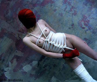
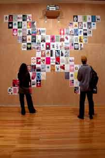
Engage (commissioned/created by Erik Adigard, a designer working with such companies as Apple, Microsoft and Sony, also engaged in new media art projects) shows some possibilities of a politically and socially active design. It is a large collection of posters whose authors look at the world in a critical way. Neutrality is not welcome here. A surprising combination of photos or an ambiguous drawing are the weapons in a fight for putting into doubt what we often unconsciously accept. “The designer stopped being a craftsman. He has become an agitator”, Adigard said during one of the conferences that accompanied the biennale. But a greater power requires greater knowledge. Influential agitators can be dangerous. That’s why the best designers know how to distinguish Coca-Cola from cocaine, and Bush from Bin Laden. In this sense, Catalysts! is an appeal not to spectators, but to designers: Go study!

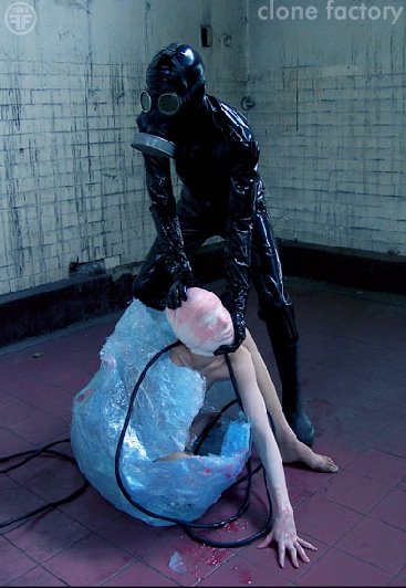
But aren’t designers becoming victims of their own methods? They often take on the role of journalists and scientists, they want to explain the world and improve the life of its inhabitants (that’s how the Inform part presents them). But they do it with no scruples, attacking as hard (effectively?) as they can. Maybe that’s why during the exhibition, the visitors, used to controversial games, take a quick look at the posters, smile at the creativity, and move along to the last room. Here, a dark room has its one wall covered by a film projection. It is a mixture of scenes that the author Rob Schröder found “fascinating, important, strange, disgusting or simply shocking” during his 40-year TV-watching marathon, staring at three screens at once. This part is appropriately called Moral Panic. This is where most of the visitors gather. They stand quietly against the walls, waiting for a scene that would give it all any sense.

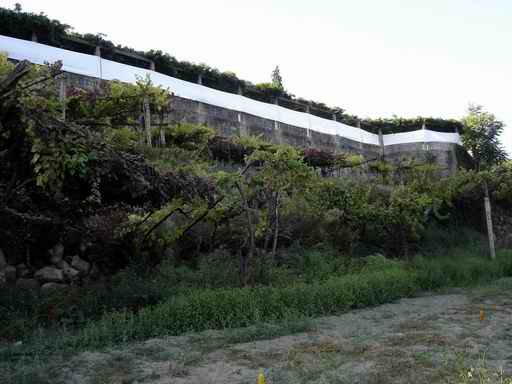
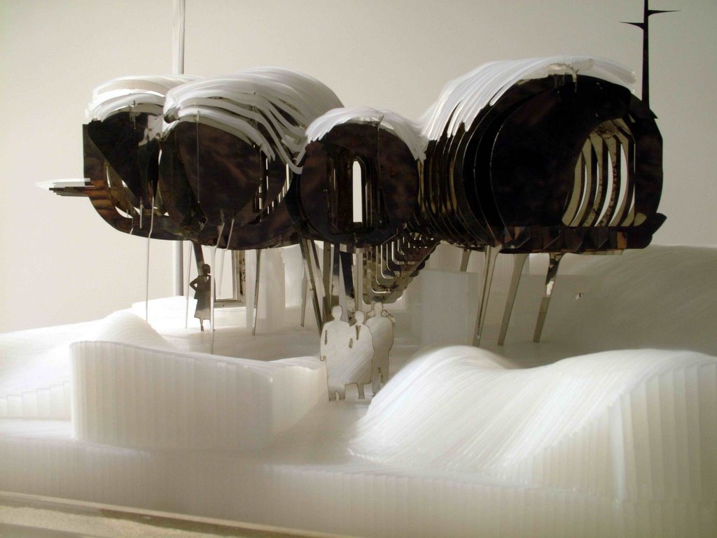
My World, New Crafts is an entirely different exhibition. One could call it an answer to the “catalysts”. The exhibition, in the midst of the Lisbon botanical garden, lacks the will for power and for a “universal civilization”. In the expression “global village” My World... focuses on the village. Does cultural identity still exist? And if so, what could it mean in the face of the challenges of technology and communication? Against pessimistic prognoses, the works gathered here show it can mean many things wonderful, diversified, and up-to-date. Here, finding oneself means a strange, sometimes useless, but always inventive employing of what is already there: a transformation, a recycling, a disarmament, but also a rediscovery of old crafts and design traditions. Furniture out of plastic containers, radio-alarm clocks controlled through Atari joysticks, modern handbags designed together with old ladies from traditional districts of Portuguese cities: My World... presents a whole range of arguments in the discussion with the gloomy prophets of the end of civilization. At the same time, it does it with humor: a pork-legged stool (author Fernando Brízio was inspired by the Portuguese pigs called Pata Negra - “black leg”), or a cup outgrown like a virus (by Kjell Rylander) are excellent examples of combining fresh, modern design with a great laugh.

ExperimentaDesign is not too interested in new technologies. The porcelain with designs made through a changing projection, or objects for using the internet without a computer, win the viewers through their creativity and charm. From a technical point, they aren’t quite revolutionary. The projects shown at the biennale also often seem unpractical, or difficult to use - as the strange “futuristic” architectural projects at the Portuguese Houses exhibition. But EXD isn’t afraid of risk: all the twelve projects will be realized in a special experimental village. They are to cost no more than the average price of real estate of a similar size in this region.

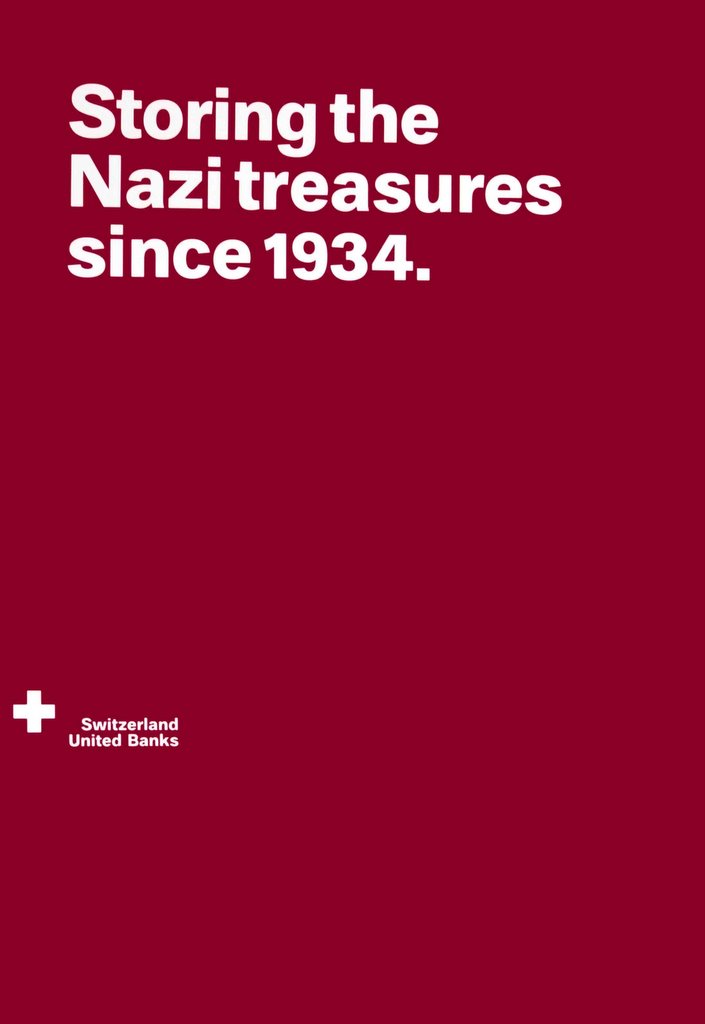
One could criticize many things about the ExperimentaDesign. For one, the biennale “headquarters”, in a wonderful, decaying palace downtown with a view on the Tagus river, besides a bar (associated brand: Super Bock beer) and a small library only has “tangentials”, or accompanying exhibitions (associated brand: IKEA), not always on the highest of levels (with a few exceptions, as this poster by Kau Bernau). A work by Stefan Sagmeister commissioned as a “solo exhibit” on a city billboard (commisioned by: Super Bock) is difficult to find, and at the Catalysts! exhibition nearby (official builder: Certame) nobody knows anything. But Portuguese people are friendly, cell phones starting ringing (exclusive sponsor: Vodafone) and a friend of a friend explained how to get there. Proving that the biennale’s motto, “The Medium is the Matter”, has one crucial meaning: it’s all about communication.

ExperimentaDesign is 5 main exhibitions, 30 tangentials, conferences, debates, films. Among other presented areas are architecture, multimedia, scenography, experimental cinema... The biennale lasted from the middle of September until the end of October. It is expected to be visited by some 150 thousand people.

More info: www.experimentadesign.pt


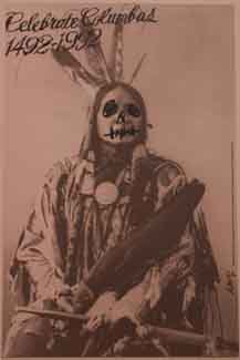
1. Engage (fragment), Erik Adigard (2005); 2.Collateral Image, Jasper van der Made (2003). 3. Columbus Day, James Victore (1992). 4. Lofting House, Marcosandmarjan (2005) 5. Switzerland United Banks, Kai Bernau, Christoph Dunst (2005) - part of the "Neutrality" exhibition. 6. Use Condoms, James Victore (1999)
All photos by Verónica Fernandes.